Let's start with the translation itself, what isresponsive design? Actually, the image above already shows it because responsive design ensures that your site is highly visible and responsive on all devices. It's all about usability and you create that by making sure the visitor is satisfied with the site's navigation.
The brief history
In a "distant" past, it was not uncommon to see a complete desktop version of a site when you opened it on a mobile device. At that time, we also didn't know any better that only zooming in as far as possible to read something or click on something. Responsive design was actually first talked about in 2010 but 2015 has been a more important year. Google also learned that usability was not really there and slowly started to change this. Why? Simply because a tipping point occurred in search results at that time. The number of mobile search results from then on exceeded the number of search results on other devices such as desktops. So responsive design did become perceived as desirable.
From then on, websites are encouraged to create user-friendly responsive versions for mobile devices. The final result is that July 1, 2019, the Mobile First Index is set active that will index the mobile version instead of the desktop version. This was the other way around until then. If the mobile version of your site delivers a poor score, it automatically translates to a poor score for your desktop version. Google also displays different search results on mobile devices. So make sure the mobile version is in order.
How to make my website responsive
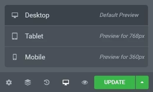
Nowadays, all leading platforms are designed for ease of use. So responsive design of your website is also taken into account. For example, the example below shows that Elementor lets you easily switch between desktop, tablet or mobile.

Common practice is to "work from big to small. So start with the design for the desktop. When this is satisfactory for the page in question, click on tablet and, if necessary, adjust anything here that is not displayed to your liking. Think of certain order of blocks or display of photos or text boxes. The last step is obviously on the mobile version. The importance has been addressed above so make sure the mobile version works perfectly.
Tip: Changes work to smaller sizes but not to larger sizes. When you change something on the desktop version it is automatically reflected on the tablet and mobile version. When you change something on the tablet version it is also changed on the mobile version but not on the desktop. Naturally, changes for the mobile version are made only for this purpose. For a good responsive design it is important to check all variants to see if all information is present and if the order is correct.
Tips
As indicated earlier, the mobile version of your site is very important. Therefore, we will give you a few tips that will ensure that the responsive version of your mobile version works in a more user-friendly way and therefore ranks higher.
Zooming in and out
If we hate anything it is zooming in or out of a site on our mobile. We want to be able to read everything immediately and "click" on everything if it piques our interest. Additionally, keep in mind that it is important that the entire mobile version is viewable on the screen. We also don't want to have to 'swipe' from left to right to read a text.
Navigation
In general, the screens of our mobile devices are getting bigger and bigger. So big, in fact, that we already stick devices on the back that keep the phone from falling out of our hands. Therefore, make sure that one can navigate the site with 1 hand/finger. Of course it may happen that something is in a remote corner but keep it in mind with the design.
Buttons and links
You should keep in mind that buttons and links should not be too small and too close together. Just assume that if someone 'clicks wrong' two or three times he or she is also left from your site.
Image size
Although these days almost all of us have a large data bundle, it is still not desirable to lose +100MB after visiting a site or even worse one particular page. Especially since images are displayed at a smaller size on a mobile devices, it is unnecessary to display them in a high resolution. In addition, this damages the loading time of the page in question so you also score minus points.
Do you have a website but think it could be further optimized and that the topic of responsive deserves attention please contact us so we can see how we can help you.